Flexible Geotechnical Analysis Software
Perform advanced finite element or limit equilibrium analysis of soil and rock deformation and stability, as well as soil structure interaction, groundwater, and heat flow.
PLAXIS 3D
The most basic PLAXIS 3D option to perform everyday deformation and safety analysis for soil and rock.
PLAXIS 3D Advanced
Get everything in PLAXIS 3D, plus enhances your design capabilities with advanced features and material models for creep or flow-deformation coupling.
Includes:
- PLAXIS 3D
- Creep or flow-deformation coupling
- Consolidation analysis
- Steady state groundwater
PLAXIS 3D Ultimate
Extend the capabilities of PLAXIS 3D Advanced.
Includes:
- PLAXIS 3D Advanced
- Analyze the effects of vibrations
- Simulate hydrological, time-dependent variations of water levels, or flow functions
PLAXIS 3D WorkSuite
Most comprehensive!
Includes:
- PLAXIS 3D Ultimate
- PLAXIS Designer
- PLAXIS 3D LE (limit equilibrium slope stability analysis)
*Prices vary per region. For more options, see licensing and subscriptions section.
- PLAXIS 3D
-
What is PLAXIS 3D?
PLAXIS 3D includes the most essential functionality to perform everyday deformation and safety analysis for soil and rock. This comprehensive software for the design and analysis of soils, rocks, and associated structures makes it easy to model in full 3D.
Reliably solve infrastructure challenges
Easily generate and scale construction sequences for excavations. Facilitate steady-state groundwater flow calculations, including flow-related material parameters, boundary conditions, drains, and wells. Use interfaces and embedded pile elements to model movement between soil and foundation, such as slipping and gapping. Get trustworthy results with realistic soil models and a complete portfolio of visualization abilities.
Get realistic assessments of stresses and displacements
To meet the unique geotechnical challenges of soil structure interactions, PLAXIS 3D offers different calculation types, such as Plastic, consolidation, and safety analysis. A range of material models for predicting the behavior of various soils and rock types, combined with robust calculations, helps ensure reliable results. You can display these forces in various ways and use cross-section applications to inspect certain areas in greater detail.
Drive efficiency with multidiscipline workflows
Create logical geotechnical digital workflows that take projects from subsurface imports through design and analysis to various outputs.
- PLAXIS 3D Advanced
-
What is PLAXIS 3D Advanced?
PLAXIS 3D Advanced includes everything that is included in PLAXIS 3D, plus it further enhances your geotechnical design capabilities with more advanced features and material models. You can consider creep or flow-deformation coupling through consolidation analysis. Additionally, you can solve your problems faster than PLAXIS 3D with the multicore solver.
- PLAXIS 3D Ultimate
-
What is PLAXIS 3D Ultimate?
PLAXIS 3D Ultimate extends the capabilities of PLAXIS 3D Advanced so you can analyze the effects of vibrations in the soil, like earthquakes and moving traffic loads. You can also simulate complex hydrological conditions through time-dependent variations of water levels or flow functions on model boundaries, as well as soil boundaries.
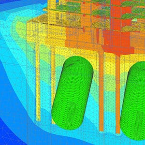
3D Geotechnical Dynamic Modeling
PLAXIS 3D Ultimate is an easy-to-use software that is suited for more advanced seismic analysis. When you need something that goes beyond the low-frequency vibrations, this is the choice for you. You can:
- Analyze the effects of human-made or natural seismic vibrations in soil
- Perform analyses on the effects of vibrations in the soil from earthquakes, pile driving, vehicle movement, heavy machinery, or train travel
- Accurately calculate the effects of vibrations with a dynamics analysis when the frequency of the dynamic load is higher than the natural frequency of the medium
- Perform a ground response analysis and liquefaction analysis using the UBCSand model
3D Geotechnical Groundwater Flow
Go beyond the default options of steady-state groundwater flow analysis of PLAXIS with PLAXIS 3D Ultimate.
- Simulate the unsaturated, time-dependent, and anisotropic behavior of soil
- Simultaneously calculate changes in pore pressures and deformation by performing a fully-coupled flow-deformation analysis
- Use the Flow-only mode to exclude displacements and stresses from the calculation if you are only interested in groundwater flow, making it easier to use.
- PLAXIS 3D WorkSuite
-
What is PLAXIS 3D WorkSuite?
PLAXIS 3D WorkSuite includes everything that you get with PLAXIS 3D Ultimate, plus you get PLAXIS 3D LE, and PLAXIS Designer.
PLAXIS 3D LE
With PLAXIS 3D LE you can model and analyze geo-engineering projects for limit equilibrium slope stability analysis and perform finite element analysis of groundwater seepage in unsaturated or saturated soils.
PLAXIS Designer
PLAXIS Designer is excellent for building 3D conceptual models to overcome the challenges of merging and analyzing data. With Bentley’s open modeling environment, PLAXIS Designer allows you to visualize and manipulate geotechnical data including topology, boreholes, piezometers, and other field instrumentation data, as well as engineering staged construction and design.
What is PLAXIS 3D?
PLAXIS 3D includes the most essential functionality to perform everyday deformation and safety analysis for soil and rock. This comprehensive software for the design and analysis of soils, rocks, and associated structures makes it easy to model in full 3D.
Reliably solve infrastructure challenges
Easily generate and scale construction sequences for excavations. Facilitate steady-state groundwater flow calculations, including flow-related material parameters, boundary conditions, drains, and wells. Use interfaces and embedded pile elements to model movement between soil and foundation, such as slipping and gapping. Get trustworthy results with realistic soil models and a complete portfolio of visualization abilities.
Get realistic assessments of stresses and displacements
To meet the unique geotechnical challenges of soil structure interactions, PLAXIS 3D offers different calculation types, such as Plastic, consolidation, and safety analysis. A range of material models for predicting the behavior of various soils and rock types, combined with robust calculations, helps ensure reliable results. You can display these forces in various ways and use cross-section applications to inspect certain areas in greater detail.
Drive efficiency with multidiscipline workflows
Create logical geotechnical digital workflows that take projects from subsurface imports through design and analysis to various outputs.
What is PLAXIS 3D Advanced?
PLAXIS 3D Advanced includes everything that is included in PLAXIS 3D, plus it further enhances your geotechnical design capabilities with more advanced features and material models. You can consider creep or flow-deformation coupling through consolidation analysis. Additionally, you can solve your problems faster than PLAXIS 3D with the multicore solver.
What is PLAXIS 3D Ultimate?
PLAXIS 3D Ultimate extends the capabilities of PLAXIS 3D Advanced so you can analyze the effects of vibrations in the soil, like earthquakes and moving traffic loads. You can also simulate complex hydrological conditions through time-dependent variations of water levels or flow functions on model boundaries, as well as soil boundaries.
3D Geotechnical Dynamic Modeling
PLAXIS 3D Ultimate is an easy-to-use software that is suited for more advanced seismic analysis. When you need something that goes beyond the low-frequency vibrations, this is the choice for you. You can:
- Analyze the effects of human-made or natural seismic vibrations in soil
- Perform analyses on the effects of vibrations in the soil from earthquakes, pile driving, vehicle movement, heavy machinery, or train travel
- Accurately calculate the effects of vibrations with a dynamics analysis when the frequency of the dynamic load is higher than the natural frequency of the medium
- Perform a ground response analysis and liquefaction analysis using the UBCSand model
3D Geotechnical Groundwater Flow
Go beyond the default options of steady-state groundwater flow analysis of PLAXIS with PLAXIS 3D Ultimate.
- Simulate the unsaturated, time-dependent, and anisotropic behavior of soil
- Simultaneously calculate changes in pore pressures and deformation by performing a fully-coupled flow-deformation analysis
- Use the Flow-only mode to exclude displacements and stresses from the calculation if you are only interested in groundwater flow, making it easier to use.
What is PLAXIS 3D WorkSuite?
PLAXIS 3D WorkSuite includes everything that you get with PLAXIS 3D Ultimate, plus you get PLAXIS 3D LE, and PLAXIS Designer.
PLAXIS 3D LE
With PLAXIS 3D LE you can model and analyze geo-engineering projects for limit equilibrium slope stability analysis and perform finite element analysis of groundwater seepage in unsaturated or saturated soils.
PLAXIS Designer
PLAXIS Designer is excellent for building 3D conceptual models to overcome the challenges of merging and analyzing data. With Bentley’s open modeling environment, PLAXIS Designer allows you to visualize and manipulate geotechnical data including topology, boreholes, piezometers, and other field instrumentation data, as well as engineering staged construction and design.
User Quote
"The power to collaborate with design, construction, and the owner is where PLAXIS really shines. During meetings, I can quickly respond to stakeholder requests by adjusting geometry and sharing multiple scenarios. Being able to model “on the fly” helps us avoid wasting time going back and forth on emails and phone calls."
— Brice Exley, P.E., Haley & Aldrich
FEATURED USER STORIES

Golder Associates
Strengthens One of the World’s Largest Subsea TBM Tunnels
Modeling with Bentley’s geotechnical applications ensured quality, safety, and a service life of 120 years.
Arup Singapore
3D Soil Simulations to Design Tower Foundation
The project team saved resource hours and avoided having to use multiple software platforms.
SAIDEL Engineering
Residential Building above Subway Tunnels
PLAXIS provided the industry model, promoting future development over West Bucharest’s tunnels.
PLAXIS Software Resources
Frequently Asked Questions
PLAXIS is an easy-to-use, finite element software application that helps with the analysis of subsurface environments for geoengineering projects.
PLAXIS is a computer application that performs finite element analyses (FEA) within the realm of geotechnical engineering, including deformation, stability and water flow. The name PLAXIS comes from Plastic and AXISymmetry, indicating the geometric types handled in the original code of the software application.
Whilst lots of PLAXIS 3D tutorials can be found on Bentley Communities, here are some FREE PLAXIS 3D learning resources available in our eStore.
By applying interface elements PLAXIS users can simulate the interaction between a structure and soil. While without an interface no relative displacement (slipping/gapping) will be possible between structure and soil.
When interface applied, node pairs will be created at the interface of structure and soil. Each node pair consists of two nodes – one belongs to the structure and the other belongs to the soil. The interaction between these two nodes consists of two elastic-perfectly plastic springs. One elastic-perfectly plastic spring to model the gap displacement and one elastic-perfectly plastic spring to model slip displacement.
If you want to receive tailored training or attend a PLAXIS 3D course that is specific to your project requirement, Bentley offers extra training and mentoring services. You can choose from tailor-made training, on-demand learning, consulting services, mentoring and more. Learn more about Expert Services here.
The price of PLAXIS 3D, PLAXIS 3D Advanced, PLAXIS 3D Ultimate and PLAXIS 3D WorkSuite varies per region. While there are various types of licensing available, a common choice is the 12-month practitioner license offered through Bentley’s eStore. When you purchase through the eStore, you get a Virtuoso Subscription, which means you get both the software AND the training, expert services, and custom mentoring you need to get started quickly.
Seequent, The Bentley Subsurface Company | Seequent is the subsurface software company within Bentley Systems. Together, we’re helping build a more resilient future by connecting the built world above ground with the hidden world below it. It’s easy to purchase a Virtuoso Subscription, through Virtuosity, Bentley’s eStore, and still get the expert technical support from Seequent’s subsurface experts.
Processor
Required: Dual Core CPU
Recommended: Quad Core CPU
Operating System
Windows 10, Windows 11
Memory
Recommended: minimum 8 GB
Large projects may require more
Disk Space
Minimum 2 GB free space on the partition where the WindowsTEMP directory resides, and 2 GB free space on the partition where projects are saved. Large projects may require significantly more space on both partitions.
For best performance, ensure that the TEMP directory and the project directory reside on the same partition.
Display
Graphics Card
Required: GPU with 256 MB OpenGL 3.3
Bentley strongly recommends avoiding simple onboard graphics chips in favor of a discrete GPU from the nVidia GeForce or Quadro range with at least 128-bit bus and 1 GB of RAM, or equivalent solution from ATI/AMD.
Video
Required: 1024 x 768 pixels 32-bit color palette, Recommended: 1920 x 1080 pixels 32-bit color palette
For the most up-to-date system requirements, visit Bentley Communities.
Licensing and Subscription options
Choose What is Right for You
One-year license with training
Virtuoso Subscription – A popular choice for small and medium-sized businesses
Get access to software that comes with training – fast! Bentley’s eStore, Virtuosity, offers a convenient way to lease a 12-month license of Bentley software for a low, upfront cost. Every online purchase through Virtuosity comes as a Virtuoso Subscription that includes training and auto-renewals.
With no contract required, it’s easy to get started quickly.
One-time purchase with support
Perpetual License with SELECT
A perpetual license of Bentley software is a one-time purchase, with a yearly maintenance subscription, called SELECT. This includes 24/7/365 technical support, learning resources, and the ability to exchange licenses for other software once a year. With SELECT, you will benefit from:
- License pooling, so you can access your software from multiple computers.
- Access additional Bentley software with Term Licenses, which allow you to pay for what you use without the upfront cost of purchasing a perpetual license.
Annual renewal quotes are delivered directly to your inbox, and our experienced Renewal Representatives are available to answer your questions and guide you through any changes you’d like to make.
Enterprise Organizations
We’ve got your back
For larger organizations with in-depth requirements, we offer plans to provide global pricing and access to our comprehensive portfolio of solutions and success plan services. Contact us about how to get access to software, global best practices, implementation services, training, and technical support to help your organization realize its full potential while addressing your unique needs.
